Chefe do Ano
- Task
- Create the visual identity and campaign system for Chefe do Ano 2026, balancing culinary prestige with a contemporary, energetic tone. The identity needed to work across print, digital and motion formats while remaining recognisable and adaptable.
- Solution
- I developed a bold visual system built around strong typography, modular compositions and a flexible graphic language. The identity was designed to scale across campaign posters, social media, event materials and animated assets, creating a coherent system rather than a set of isolated pieces.
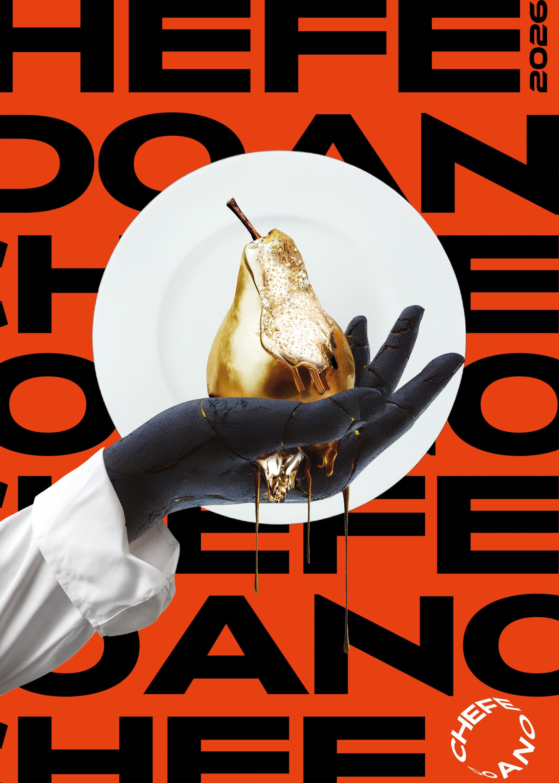
Concepts
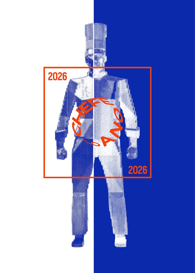
Selected by the client
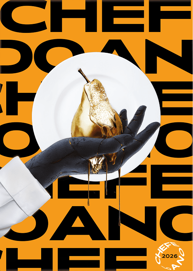
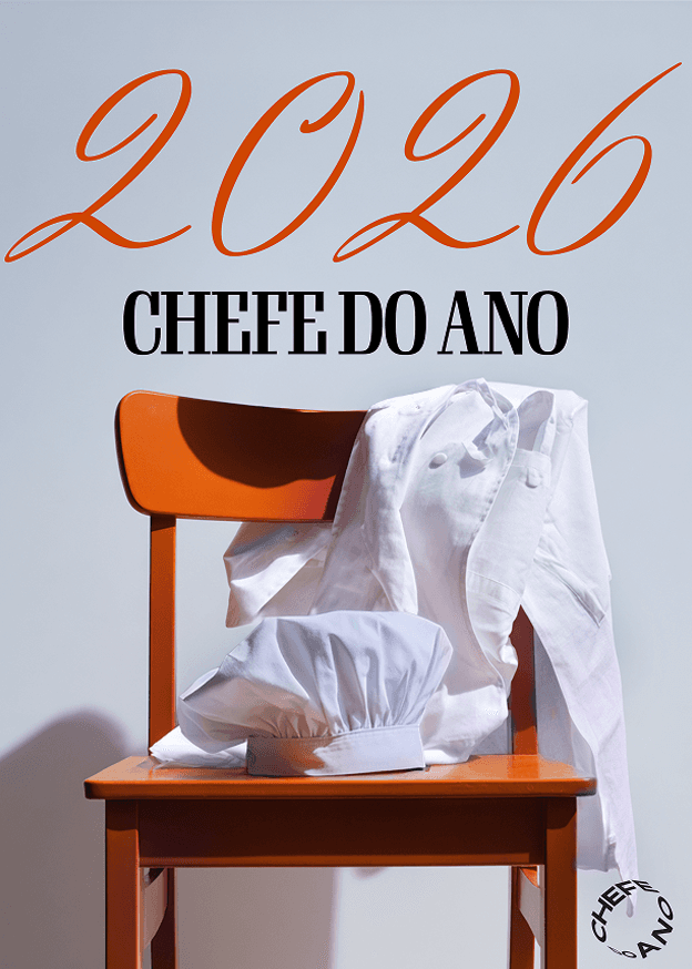
Identity system
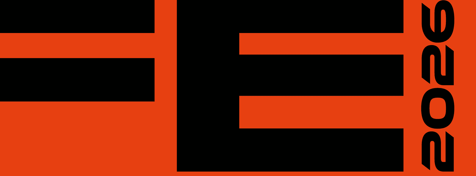
Typography
Display face carries the campaign; numerals are a second voice.

Colour
Three flat colours plus gold as a material, not a fill.
Brand orange#E74011The field.
Black#000000Type, and the shadow under the sleeve.
White#FFFFFFThe plate, and the chef whites.
Gold#CFAF52Sampled from the object, not a flat colour.
Print values come from the CMYK master — don't convert from screen.
Graphic language
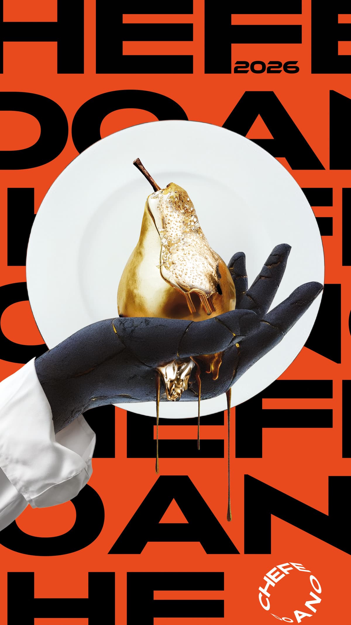
Type builds the field — it is background, pattern and headline at once.
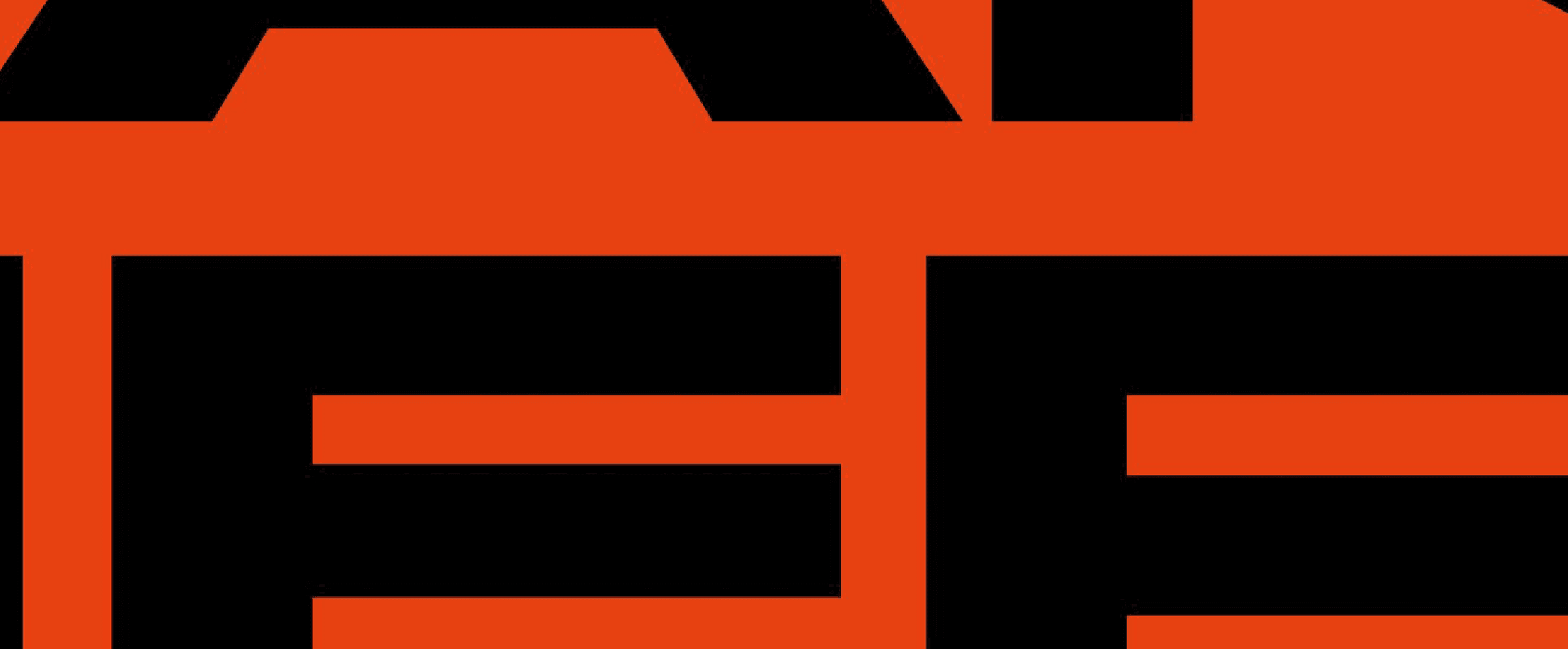

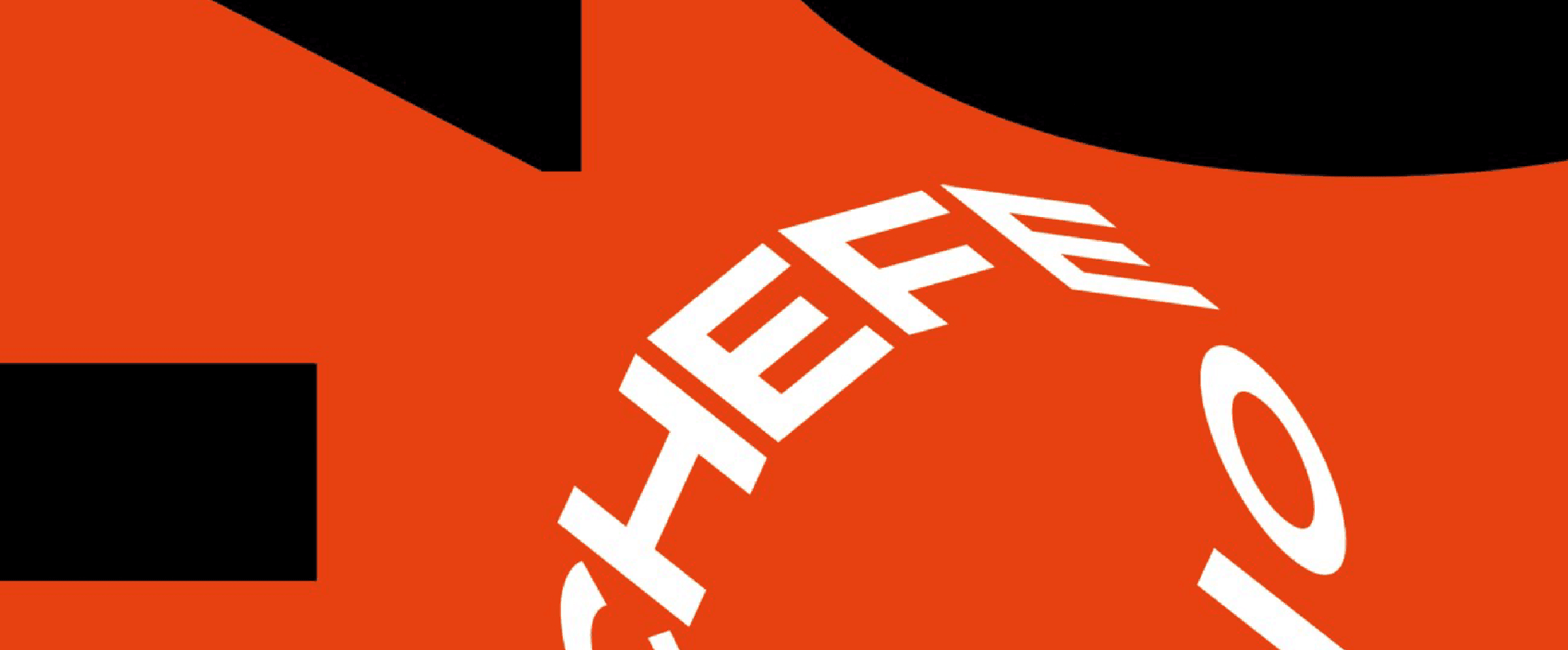
Image treatment
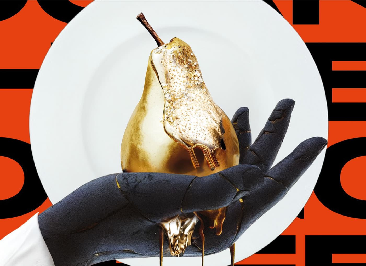
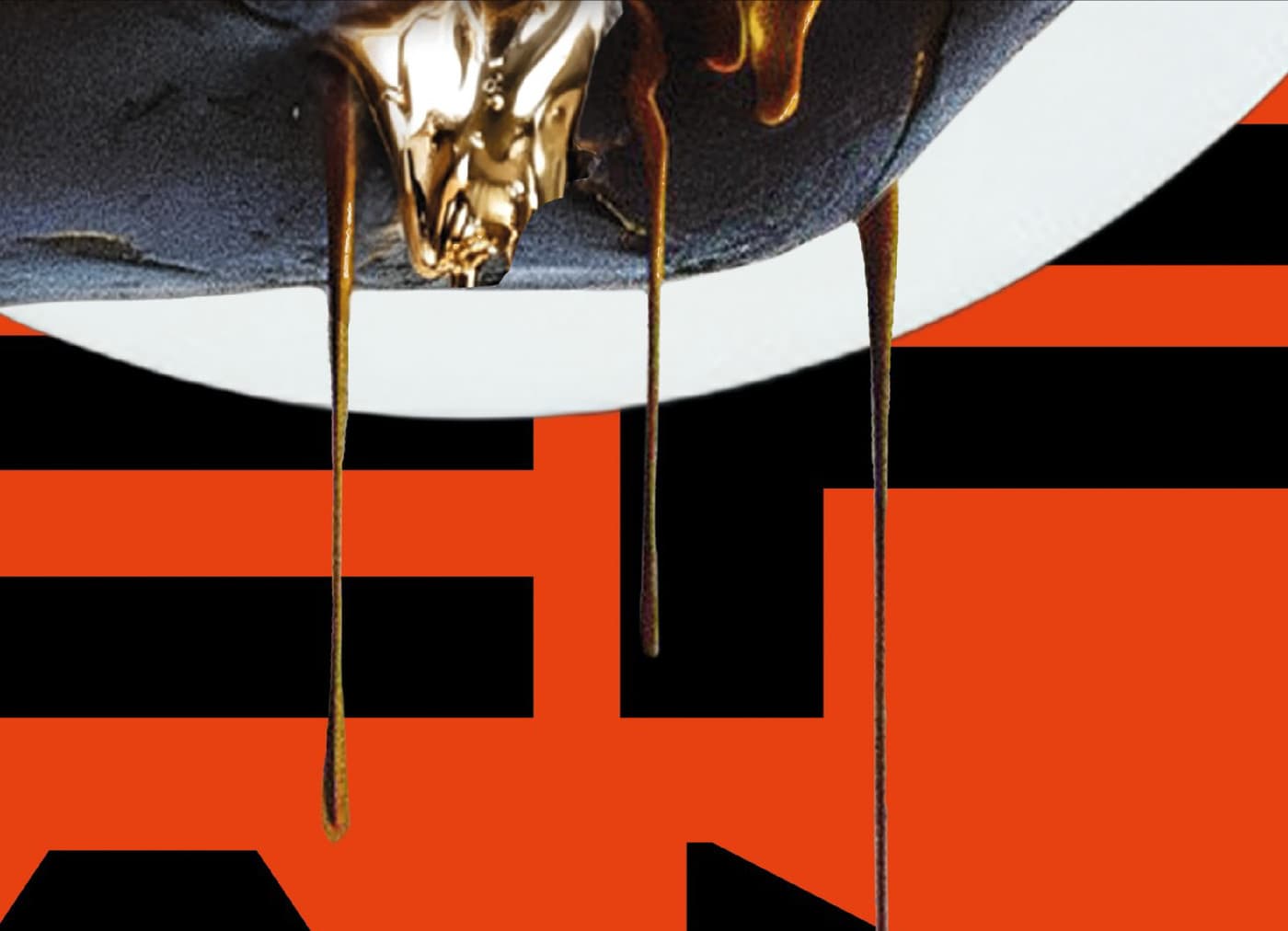
One hero object, studio-lit, no environment.
Composition
The rule any new format has to keep.
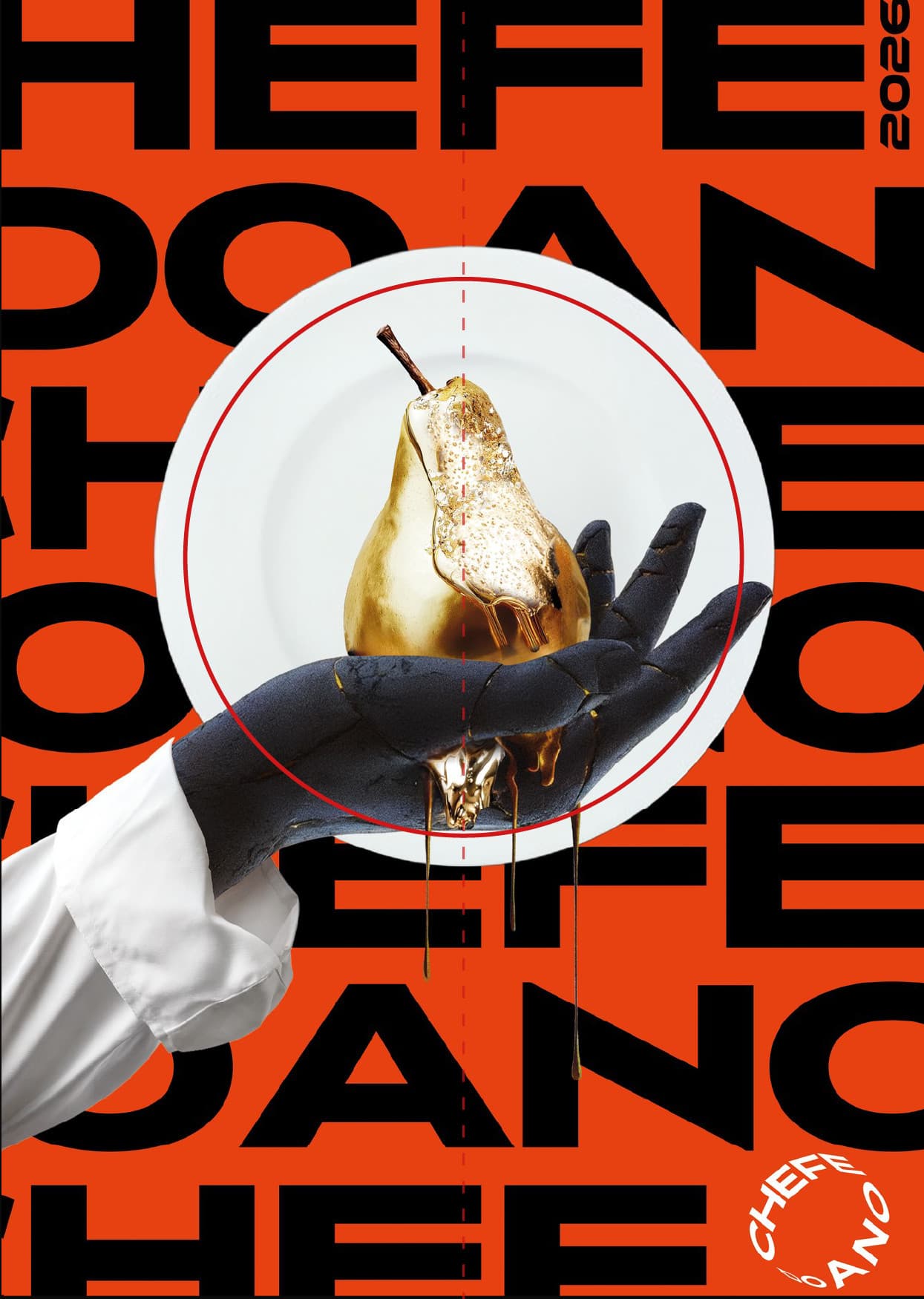
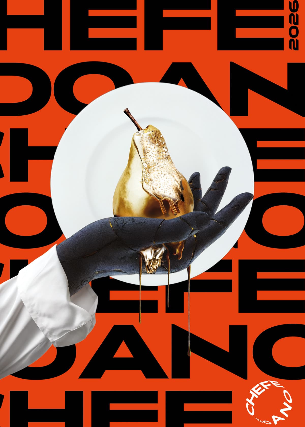
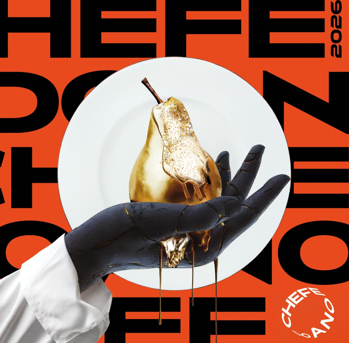
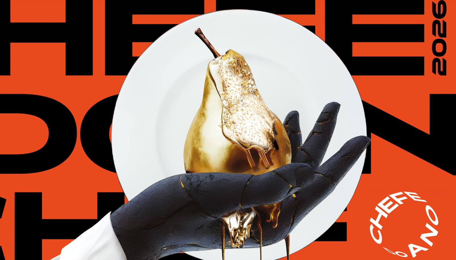
- Hero object centredOn the vertical axis, in the upper half
- Type field behindRuns edge to edge, cropped on all four sides
- Year at the outer edgeVertical, top right
- Seal in the free cornerOpposite the sleeve
- Nothing else entersNo environment, no secondary imagery
Motion principle
The object is animated — the field is not.
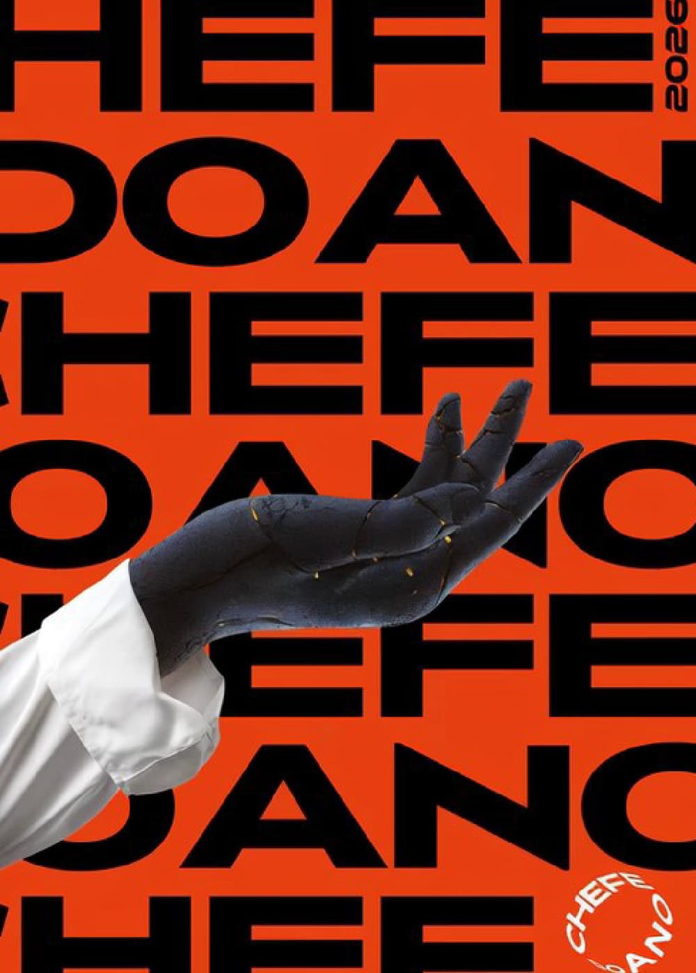
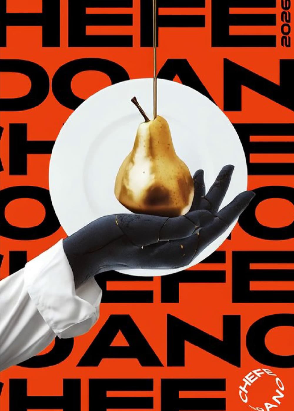
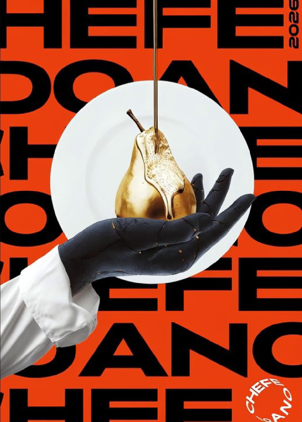
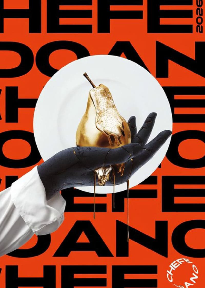
Field locked: the background measures #E63F11 at both ends of the clip · 5 s · 24 fps.
Applications
The same master, re-cropped — not redrawn.

Handover
- Prepress — CMYK · PDF/X-4 · 3 mm bleed · print-ready exports.
- Out of scope — screen printing, menu design.