Renaissance
- A display face drawn from paintings
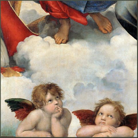
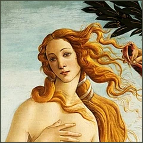
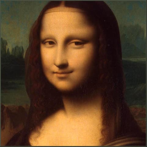
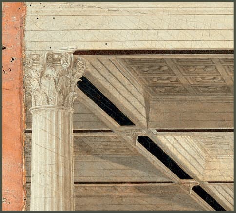
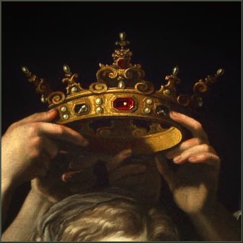
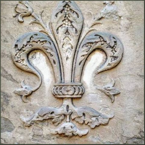
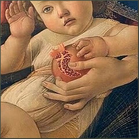
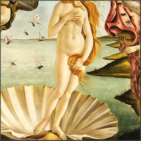
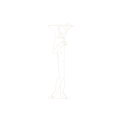
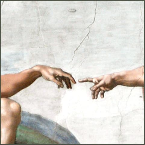
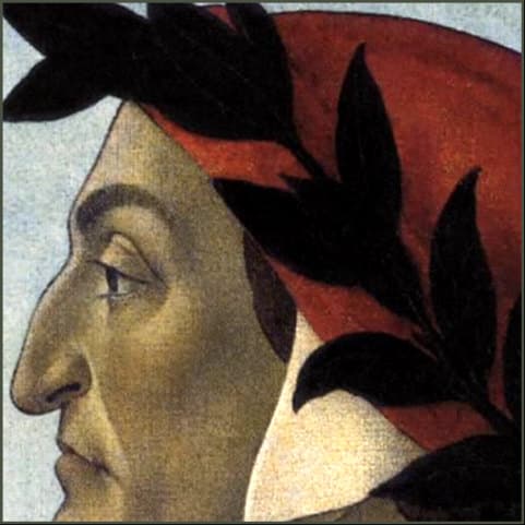
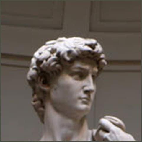
- Twelve capitals so far, each one begun in a painting. A fragment is isolated, stripped of colour and volume, and left as contour — then built into a letterform until neither the drawing nor the letter can be taken away without the other collapsing.

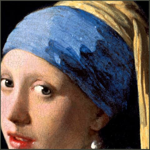
Source
Each letter begins in a painting. A fragment is isolated, stripped of colour and volume, and left as contour — then built into a letterform.











Method
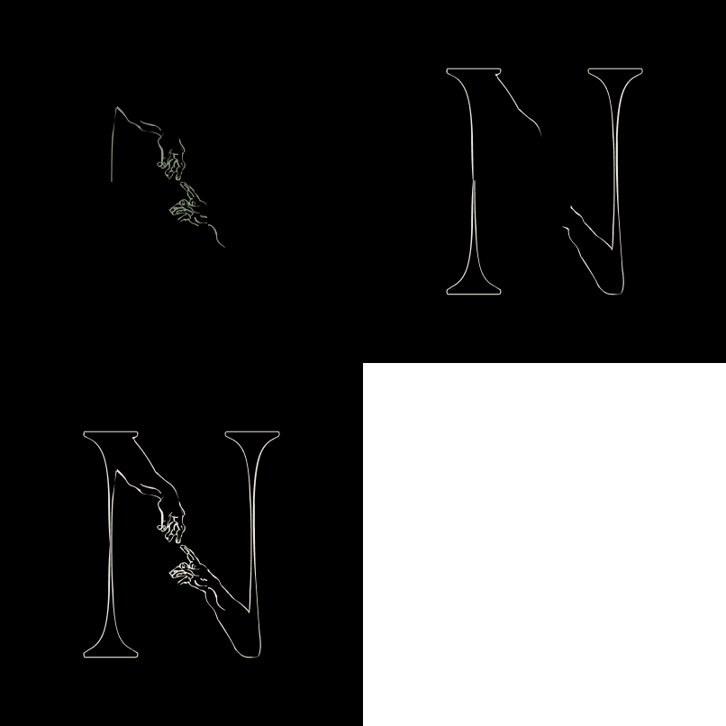
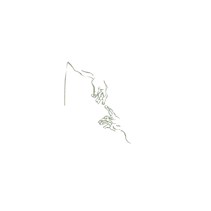
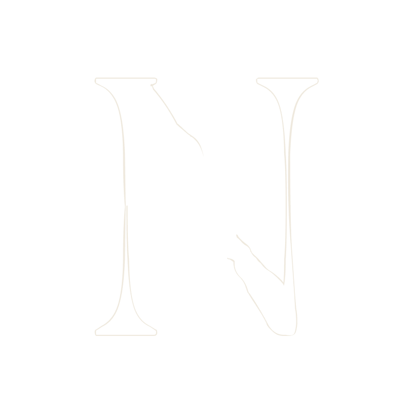
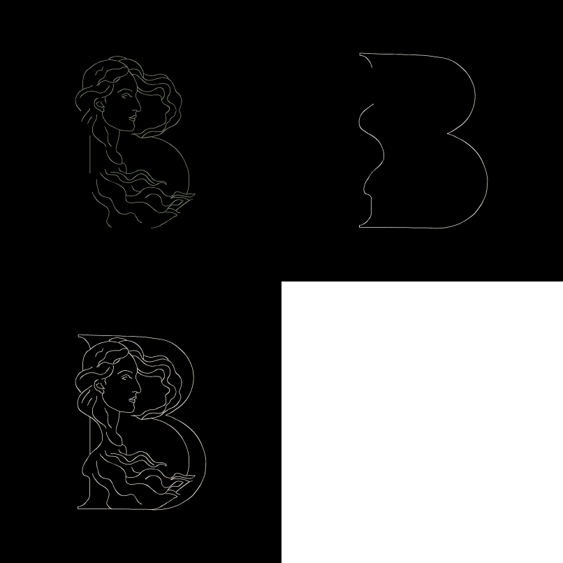
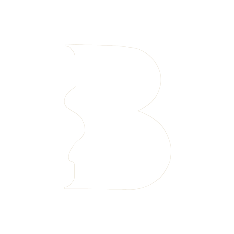
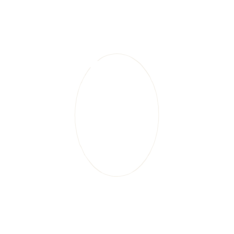
Four stages, shown on three letters. The contour is lifted from the painting; the skeleton is what remains of the letter without it.






Threshold
Two floors, not one. Below the first the letter breaks; below the second it holds, but the drawing that justifies it has closed up.
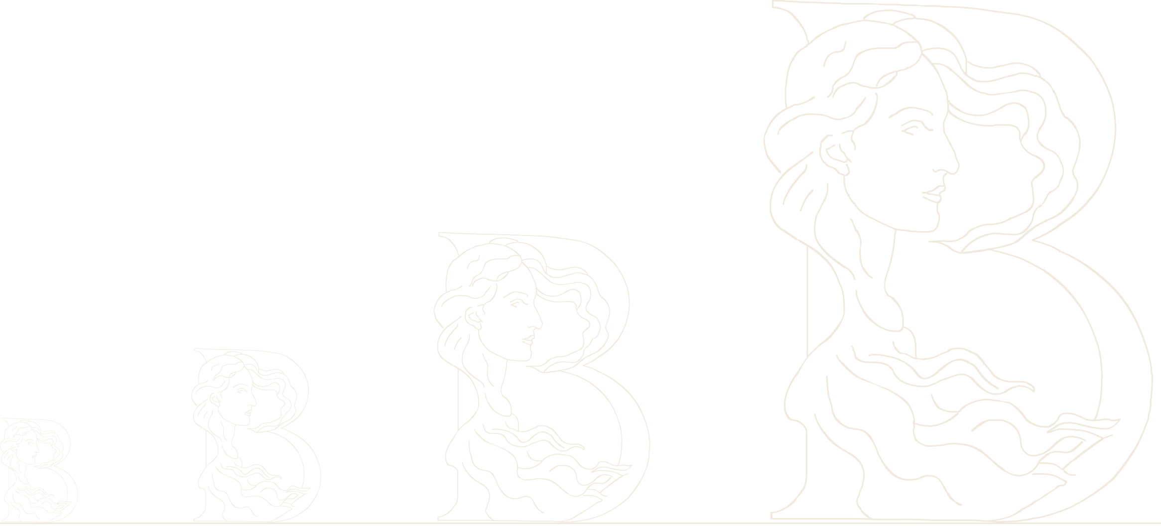
- 120 px — letter floorUnder this the counters fill and B stops being a B. Nothing below it is usable at all
- 200 px — drawing floorAbove 120 the letter survives, but the face, the hair and the wreath collapse into grain. Below 200 there is no reason to use this typeface rather than any other serif
Sizes given as cap height in px. Point sizes follow once the UPM is corrected to 1000.
Delta
The same paragraph, the same text face, the same leading. One letter is the only difference between the two columns.
01 Without
Renaissance painting is built in layers. Beneath the colour there is a drawing, and beneath the drawing a scaffold of proportions no viewer was ever meant to see. These letters come from that hidden layer. Each begins as a fragment lifted from a panel or a fresco — a hand, a wreath, a fall of hair — reduced until only its contour remains, then fitted to the skeleton of a letter until neither can be taken away without the other collapsing.
02 With

enaissance painting is built in layers. Beneath the colour there is a drawing, and beneath the drawing a scaffold of proportions no viewer was ever meant to see. These letters come from that hidden layer. Each begins as a fragment lifted from a panel or a fresco — a hand, a wreath, a fall of hair — reduced until only its contour remains, then fitted to the skeleton of a letter until neither can be taken away without the other collapsing.
Drop cap set 6 lines deep — 168 px cap height. A conventional three-line initial would sit at 81 px, under both floors, and the drawing would be lost entirely. This face does not take a book-standard initial; it needs a generous one.
Applied
One letter at a time. Nowhere in this strip is the typeface used for reading — it opens, it marks, it signs, then it gets out of the way.
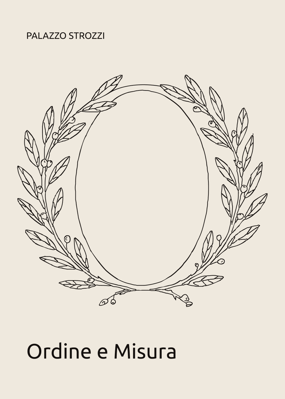
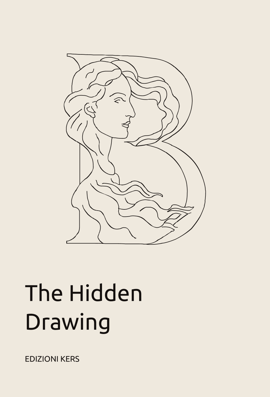
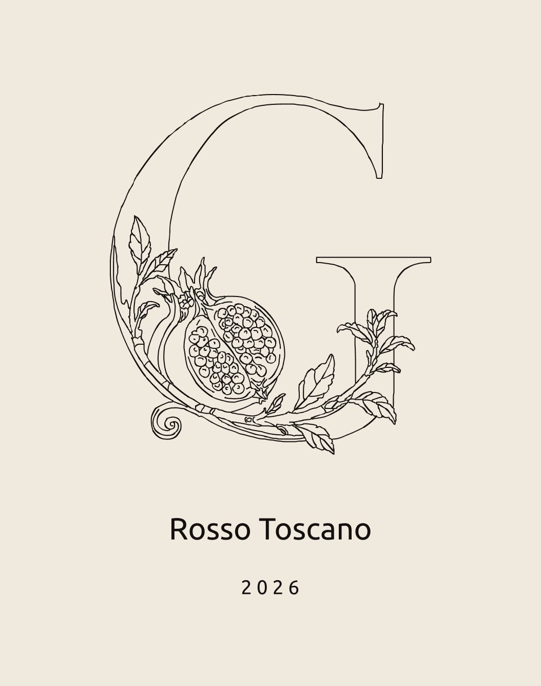

Words are spaced by ink width — the file's advances are all a flat 600 and still collide.
Press
The drawing was lifted off a painted surface; it goes back onto one. Screen printing sets its own floor, and it is not the same as the screen's.
Thinnest line at print size
- Book cover — 40 mm cap0.12 mm · under mesh
- A3 poster — 80 mm cap0.25 mm · at the limit
- 50 × 70 poster — 160 mm cap0.50 mm · holds
- Wall piece — 400 mm cap1.25 mm · holds
Measured stroke is 0.31% of cap height at its thinnest. A 120T mesh resolves about 0.25 mm. Below an 80 mm cap the finest lines drop out of the stencil and the drawing breaks up.
Screen floor was 200 px. Press floor is 80 mm. Same cause, two media — the drawing is thinner than either can carry small.
Reveal
The ornament is laid down from the root up, contour after contour, so the letter is not revealed but grown. Nothing fades in — the line is drawn.
F · acanthus, wing · drawn from the root up
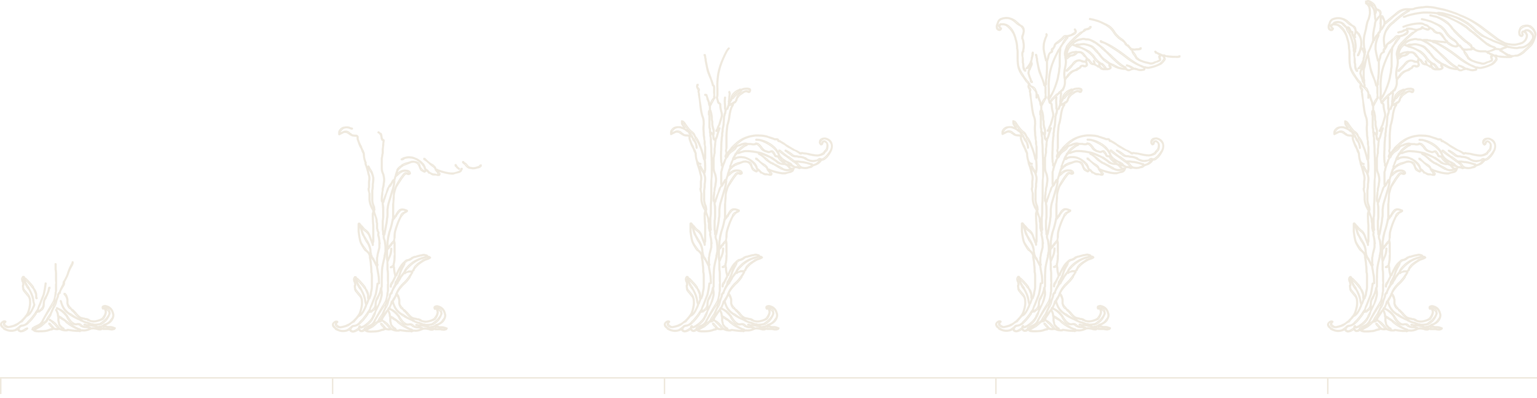
Built as a stroke on the outline — the same path a plotter or a cutter would follow, so the animation is not an effect added afterwards but the drawing repeating itself.
2.4 s, ease-out. Runs once when the block scrolls into view.